The "We'll fix your label for you" thread

Homebrew Talk - Beer, Wine, Mead, & Cider Brewing Discussion Forum

Help Support Homebrew Talk - Beer, Wine, Mead, & Cider Brewing Discussion Forum:

This site may earn a commission from merchant affiliate links, including eBay, Amazon, and others.
I'm going to redo the Hops and Grain next. I've found some higher-resolution artwork for both. I want more of both, and some stems coming from the bottoms of the talons.

When you asked about the name, I know I suggested "Department"... but, I accidentally used "Bureau" on my mockup... "Bureau" has grown on me. I prefer it now!

Do you like the general layout? Navy blue with white rings and text... gold balls around the eagle... mug overhead? (I do!)

I think Bureau is growing on me as well (my wife also prefers it), and I really like "In Cervisio Felicitas". I do like the general layout--I think those colors work well, and overall it's suggestive of an official government seal.

Thank you so much for doing this, I think it's looking great!
 
Did a little work on the outside rings and text... What do you think? (Again, this is a scaled down, lower-res version. This is 600x600 pixels, I'm doing the final version at 2000x2000 pixels.)

The font I used here, in case you want to use it elsewhere to match, is Copperplate Gothic Bold. Or, I can use something else, if you like!

BOF Seal Outside 600px.png
 
Yeah! It's very "governmental", ain't it?

Also... the gold balls... OK if I change the number of them? Or does 47 have some significance to you? I know sometimes these things have special significance on a seal. It's just easier to space a number that divides evenly into 360 degrees... I'm thinking 40...

Or do you have some number in that ballpark (say 30 to 50...) that IS significant to you???
 
I was born in the 47th month of 1947 at 47:00AM, so I'm afraid no other number will suffice.

36 has a fair amount of personal significance, but the number of gold balls is pretty low on my priority list. If 36 works well, I'd say go with that, but if 40 looks better, that's cool too.
 
OK... Here it is! Forum software scaled it down to 1600x1600 pixels and converted it to JPG. PM me with your email address and I'll send you the 2000x2000 pixel PNG file (2.3MB) with a transparent background.

That's nice damn work right there. Great job. :mug:
 
Okay guys, I'm getting my PhD in physics, so I figured I should get a Mad Scientist-themed label for my bottles, and my creative friend still hasn't produced one after much badgering. So, anyone want to take a swing at it? I'm thinking something along the lines of Doc Brown from Back To The Future, with the welding goggles on his forehead. Like the sketch, but slightly less horrified-looking, if possible.

DocBrownGoggles.jpg


DocBrown.jpg


DocBrownSketch.jpg
 
I've got a design I came up with for my brewery logo that I think is a great jumping off point but I can only do so much with PowerPoint and the snip tool (yes, that's what I used, not what you would consider classically trained). But if someone could clean it up and make it look like it was done w/ care and not with PPT and the snip tool that would be great.
927495d4-72b5-4623-83cd-9a9a300583c2_zpsssdnn3gk.png

I'd be open to better font and how the font fills the head space. I also like the barley idea and the kind of... IDK, graphic/blocky/alien look to it but the proportions are kind of off (doesn't fill the glass the way I'd like it too I guess) and the light green discoloration around it I'm actually OK with from a visual depth perspective but its only in the corners as a result of snipping/editing and I'd like to to look intentional and cohesive.
 
Hi Everyone,

I am a far cry from computer savvy so I’m reaching out to you all to see if you can help me with my label idea.

I have an idea of using picture #1 of my two cats below as almost a header for a label. Picture #2 is kind of the look I was thinking of. A cat on either side tails hanging down (possibly even silhouettes) with “TWO BAD CATS BREWERY” in the middle. Then I could use the rest of the space for the name of the beer and a picture. Thoughts? I was hoping to use that as a label template for my bottled beers then fill in below it with the beer name and pic I might want to use.

Lastly, picture #3 is of one of my black cat and I was looking to have it superimposed on an upright oak barrel and call it Lazy Barrel Brown, ABV 7.35

What do you think?

Thanks,
Eric

Two bad cats BW.jpg


template.jpg


Wiggins.jpg
 
I've got a design I came up with for my brewery logo that I think is a great jumping off point but I can only do so much with PowerPoint and the snip tool (yes, that's what I used, not what you would consider classically trained). But if someone could clean it up and make it look like it was done w/ care and not with PPT and the snip tool that would be great.
927495d4-72b5-4623-83cd-9a9a300583c2_zpsssdnn3gk.png

I'd be open to better font and how the font fills the head space. I also like the barley idea and the kind of... IDK, graphic/blocky/alien look to it but the proportions are kind of off (doesn't fill the glass the way I'd like it too I guess) and the light green discoloration around it I'm actually OK with from a visual depth perspective but its only in the corners as a result of snipping/editing and I'd like to to look intentional and cohesive.

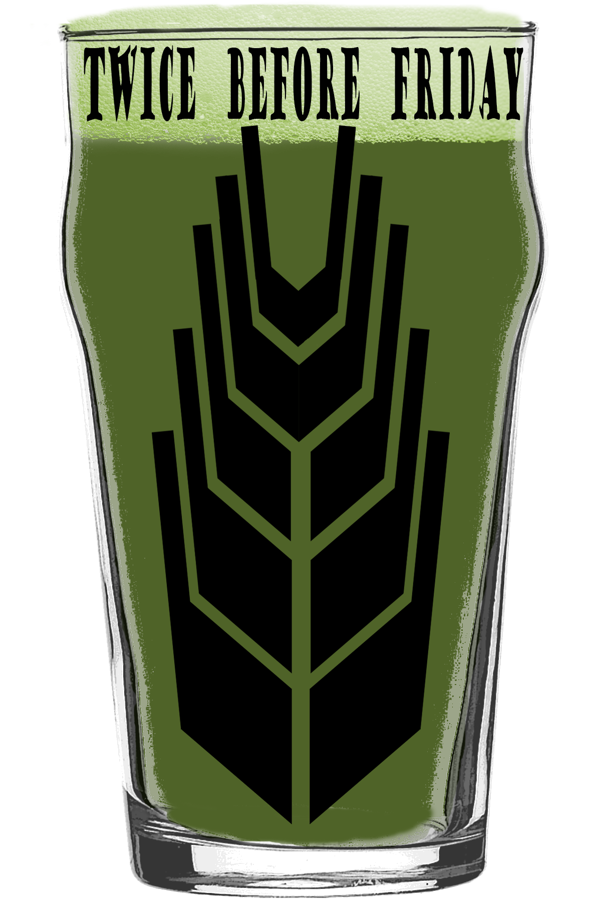
Here is my take on your label. I changed it a bit but I feel like I kept the overall feel. I made it kind of huge so that you can resize it and still print with good resolution. Hope you like it!
MWXrrrV.png
 
I've got a design I came up with for my brewery logo that I think is a great jumping off point but I can only do so much with PowerPoint and the snip tool (yes, that's what I used, not what you would consider classically trained). But if someone could clean it up and make it look like it was done w/ care and not with PPT and the snip tool that would be great.
927495d4-72b5-4623-83cd-9a9a300583c2_zpsssdnn3gk.png

I'd be open to better font and how the font fills the head space. I also like the barley idea and the kind of... IDK, graphic/blocky/alien look to it but the proportions are kind of off (doesn't fill the glass the way I'd like it too I guess) and the light green discoloration around it I'm actually OK with from a visual depth perspective but its only in the corners as a result of snipping/editing and I'd like to to look intentional and cohesive.

@SGTSparty - I was bored at the office this afternoon so I took a stab at yours, pretty easy one. Pretty darn easy to make any changes you'd want to see on this one.

Twice Before Friday.jpg
 
Do you mind if we try it without the sign? Just the name in large lettering and ABV?

@EMH5 - sure, we can do whatever you'd like. Something more like this?

If you like it I can make the kitty look a little better. The bottom of the picture you provided is pretty dark, along with a black cat you lose some detail. Do you want the lettering on the barrel or outside of it somewhere? If outside, where exactly? What about the font? I'm just guessing here buddy.

Wiggins Barrel 1.jpg
 
@EMH5 - sure, we can do whatever you'd like. Something more like this?

If you like it I can make the kitty look a little better. The bottom of the picture you provided is pretty dark, along with a black cat you lose some detail. Do you want the lettering on the barrel or outside of it somewhere? If outside, where exactly? What about the font? I'm just guessing here buddy.
I want to start by saying I can’t thank you enough for this help. I appreciate it. And to answer your questions:
Yes, please feel free to doctor up the cat. As you said, a black cat does not show well in photos and this pic was easily the best I have that doesn’t look like a full shadow.
I was thinking of using Chiller bolded as a large font. Lazy Barrel bowed over the top of the barrel and have Brown bowed under the barrel with the ABV under Brown.
Lazy Barrel
(barrel picture)
Brown
ABV 7.35%​
Thoughts? I’m open to any ideas you have on what might look good.
 
Cold crashing a Chimay red clone right now. Here's a Belgian flag themed label I'm tinkering with. Brewed it with a friend who's given name is Lyman. He lived near our favorite brewery for a few years where he developed a taste for strong ales. This is my first abbey styled beer so I had a steep learning curve. I told him we needed a neck wrapper for this special, near vintage extravaganza.

Screen Shot 2016-06-01 at 9.47.06 PM.png


monk.png
 
Not sure how I have missed this thread for so long, but it is very cool to see people generous enough to share their talents like this. I fall squarely into the category of "no photoshop skills." I have a Maple/Coffee RIS that I brew with a friend annually. I have always wanted to make labels for this beer and have had an idea that is beyond my meager tech skills. If anyone has time, I would appreciate any help I can get..... Thanks!

Here is what I am thinking -
* The black hole photo as the "main" aspect of the label.
* Name of beer is "Black Hole Sun"
* Beer = RIS with Maple and Coffee
* ABV = 11%
* Brewery Name is Fat Porter's Ale House (may or may not work to include - I also attached my basement brewery logo.... Perhaps the smaller banner part of the logo would be useful???)
* Brewers - Kevin Kearney and Matt Duffee (may or may not be worth putting on the label)
*Other ideas???

blackhole.jpeg


View attachment FatPortersAleHouse_logo.pdf
 
... I have "no photoshop skills."

You know, for what it's worth, there are many free online design websites. If you can type and learn to take a screen shot, it will go a long ways for the average hobby brewer to class up their beer bottles. Google beer label maker... The templates are easy so often it's just substituting text and uploading art you've either taken a photo of or snipped/downloaded from somewhere. This took 8 seconds...

blackholesun.png
 
You know, for what it's worth, there are many free online design websites. If you can type and learn to take a screen shot, it will go a long ways for the average hobby brewer to class up their beer bottles. Google beer label maker... This took 8 seconds...

This thread is about helping people who don't feel artistic, not calling them out for not wanting to.
 
You know, for what it's worth, there are many free online design websites. If you can type and learn to take a screen shot, it will go a long ways for the average hobby brewer to class up their beer bottles. Google beer label maker... The templates are easy so often it's just substituting text and uploading art you've either taken a photo of or snipped/downloaded from somewhere. This took 8 seconds...

True.... likewise

*B'run water is also free, and easy. And yet, there are 50 questions a day from "average hobby brewers" that could easily dial in their water while having the chemistry knowledge of a HS kid.

*There are tons of recipe formulators on line.... it is the easiest thing in the world to put together a high quality recipe for "the average hobby brewer".... and yet, we have 100's of threads asking for recipe help.

*Harvesting, storing, propogating and repitching yeast from a single vial and carrying it through 30 beers is a piece of cake.... the information is free - just google it...... and yet, people are constantly asking for advice.......

etc.

Some people are better or more knowledgeable about different things in brewing - be it recipe, technique, building, ingredients, water, label design, etc...... Kind of the point of a forum.... and really, really the point of a thread titled: "We'll fix your label for you."

:mug:
 
This thread is about helping people who don't feel artistic, not calling them out for not wanting to.

Then there's always that guy... you try to teach someone how to fish AND you give him a fish, but nope just not good enough for you. You want to point out how wrong I am... I also provided him a potential label, which you conveniently opted not to quote... Some people :rolleyes: I wonder how you vote?
 
Back
Top