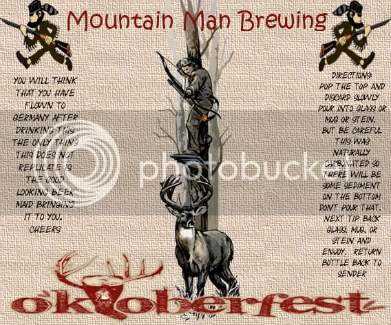
My wife has been making these in her free time, they need polishing but you get the idea.


If you where in Leadville you could brew at 10,000 feet


My wife has been making these in her free time, they need polishing but you get the idea.
If you where in Leadville you could brew at 10,000 feet


Blackdiamond72 said:My wife has been making these in her free time, they need polishing but you get the idea.
I LOVE bleeding cowboys font. I use it alot for anything from softball league shirts to beer labels. The wife gets +1 from me
Or whoever decided to use that for your name. Stupid phone. Can't figure out how to edit my posts


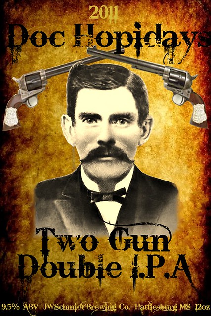
Just finished this one. Good beer too!

Awesome government warning! :rockin:
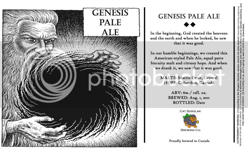
This may not be my final label...I may add some more info about this...but I like the way it came out.
What do you think?
Thefirebuilds said:classy!
ronzorelli said:I dig it!
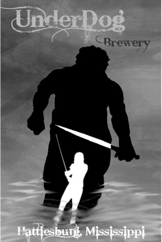
What do you think?
I really like it. My only suggestion (for you to do with what you like), would be considering adding the frame to the portrait. It kind of floats and the photo is cropped for a frame. You could also try darkening some or all of the photo, which is considerably lighter than the vibrant, contrasty background. Adding contrast to the photo may help unify the individual componants of the label. Again, just some thoughts...it's cool as is.
I see what you mean. I kinda wanted to give it a little bit of a 3D look (if you can see how some of my layers overlap. The frame is a good idea and I might make a version and see how it looks. Thanks for the input!
I really like it. My only suggestion (for you to do with what you like), would be considering adding the frame to the portrait. It kind of floats and the photo is cropped for a frame. You could also try darkening some or all of the photo, which is considerably lighter than the vibrant, contrasty background. Adding contrast to the photo may help unify the individual componants of the label. Again, just some thoughts...it's cool as is.
I tried the frame and didn't like it at all. I did like when I darkened "Doc" and I softened the edges of his protrait so it wasn't so sharp..Made him a little bigger..I also added a little contrast and a yellow tint to his skin to blend in with the background....Which do you like better? The original or edit?
Original
Edited

ok, that's cool.
What are the sizes you use for this? either pixels or inches
Enter your email address to join: