You are using an out of date browser. It may not display this or other websites correctly.
You should upgrade or use an alternative browser.
You should upgrade or use an alternative browser.
Show Us Your Label
- Thread starter muse435
- Start date

Help Support Homebrew Talk - Beer, Wine, Mead, & Cider Brewing Discussion Forum:
This site may earn a commission from merchant affiliate
links, including eBay, Amazon, and others.

ViperMan
Well-Known Member
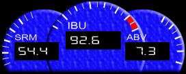
I think the gauges are a really neat idea. I think they really help for non beer geeks who don't know 75 ibus from 75 hogsheads. Couldn't you just keep the font size of the gauges the same and decrease the size of the gauges themselves if you want to make them smaller?
Not really - if you shrink the "tick marks" and not the numbers, then "40 50 60" becomes "405060" - then again shrink the numbers too, and you get "xososo" - you can't read it anymore.
I actually had this idea as well - getting rid of the numbers and needles, shrinking the gauges more and just keeping the LCD readout - basically it becomes a "digital gauge". Here's a rendition:
And incorporated into the label itself...
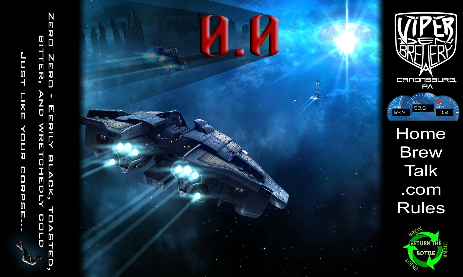
Now I just printed this out, and the identifiers for each number - "ABV", "IBU", etc - becomes hard to read, but a drop shadow or outerglow on the layer could help that. It is getting pretty small though - I might need to bump up to 400 dpi (everything is currently 300) and that makes finding detailed-enough source images for the backgrounds pretty tricky.
As usual, you've outdone yourself! My vote is on the larger label, but both are outstanding. Just wondering if you have some inside information - Is that a picture of an up and coming MOPAR product?
Haha - thanks. No the background image is from EVE Online - an MMORPG video game. With the (top) label being printed, I'm going to pose the bottles against some in-game screen shots and actually advertise it back to the company who makes the game - CCP Games out of Iceland. I'm kinda hoping they'll A ) make the beer an in-game item that can be bought/traded/sold, or even B ) wish to procure a few kegs/cases for their annual player conventions/parties (held in Iceland and Las Vegas) and - since I can't sell them the beer directly - I could possibly trade it for lifetime memberships, swag, in-game currency, who knows.
")
Just a thought...
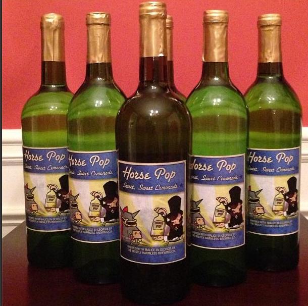
The beer by the way - people like it...

Made more to figure out what the hell I'm doing in GIMP than anything else.
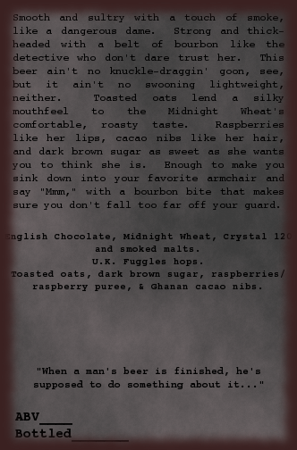
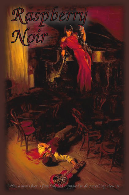
Girlfriend requested a raspberry chocolate stout, still working the recipe. Description needs to be more...noir-ish, and the front label is even more of a dark blurry mess when printed. I want to keep the name text dark, figuring out a way to make it readable.
Front:
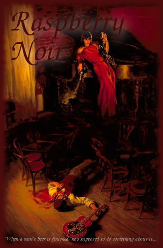
Back:
Girlfriend requested a raspberry chocolate stout, still working the recipe. Description needs to be more...noir-ish, and the front label is even more of a dark blurry mess when printed. I want to keep the name text dark, figuring out a way to make it readable.
Front:
Back:
Made more to figure out what the hell I'm doing in GIMP than anything else.
Girlfriend requested a raspberry chocolate stout, still working the recipe. Description needs to be more...noir-ish, and the front label is even more of a dark blurry mess when printed. I want to keep the name text dark, figuring out a way to make it readable.
Front:
Back:
I like what you're trying to do there. Obviously you'll need lighter text. When you've got GIMP figured out, teach me


Made more to figure out what the hell I'm doing in GIMP than anything else.
Girlfriend requested a raspberry chocolate stout, still working the recipe. Description needs to be more...noir-ish, and the front label is even more of a dark blurry mess when printed. I want to keep the name text dark, figuring out a way to make it readable.
Maybe try selecting a color from the picture, like the red in her dress, and do a fine border around the black text. I don't use GIMP but I'd think it would be doable and would help it stand out against the "almost" black parts of the background.
Calichusetts
Well-Known Member
Made more to figure out what the hell I'm doing in GIMP than anything else.
Girlfriend requested a raspberry chocolate stout, still working the recipe. Description needs to be more...noir-ish, and the front label is even more of a dark blurry mess when printed. I want to keep the name text dark, figuring out a way to make it readable.
Just remember, how it looks on your screen is way more brighter than when you print. Photoshop has an option to show you how it looks printed, don't know about GIMP. Think of it this way, the colors on your screen are being EMITTED from the screen, they actually light up the color, this is not what happens on the paper. Brighten up the whole image and print a few...you'll figure it out.
PS-Laptops are really bad with this, the angle of the laptop affects how bright it appears. I teach photography and this happens all the time, students are very disappointed with the printed result as to what they saw on a computer
Good point. The rattletrap printer I'm working with is nothing like top-end either, so the prints come out a lot more pixellated than it looks on the screen.Just remember, how it looks on your screen is way more brighter than when you print. Photoshop has an option to show you how it looks printed, don't know about GIMP. Think of it this way, the colors on your screen are being EMITTED from the screen, they actually light up the color, this is not what happens on the paper.
Ugh, tell me about it. 'S a pain in me arse working on this at home, every time I shift position I have to tilt the screen.PS-Laptops are really bad with this, the angle of the laptop affects how bright it appears.
Yeah, I think that's the way to go. I found a how-to on outlining text with the Paths tool, but the only hitch is that it will only outline it in black. Which works fine for this, since I think black outlining red would look better than vice-versa.Maybe try selecting a color from the picture, like the red in her dress, and do a fine border around the black text.
Lightened up the red in the name, outlined it in black, kept some drop shadow and brightened up the whole thing. I kinda like it. I have a more current version of GIMP on my laptop at home, when I get back I'll try the 'Oilify' filter on the name text so it looks painted. The version I have on this computer just makes things look blurry and messy.
Still not certain I'm going to use this pic, I have a handful of potential candidates.
So i found some surreal art i had to use because of the bee's nest in the hair of the girl...its seemed perfect for mead...i had to snatch it up and use it for my strawberry-vanilla. Hard to see it in the photo but it turned out great IMO.
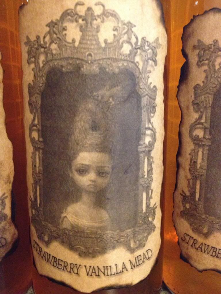
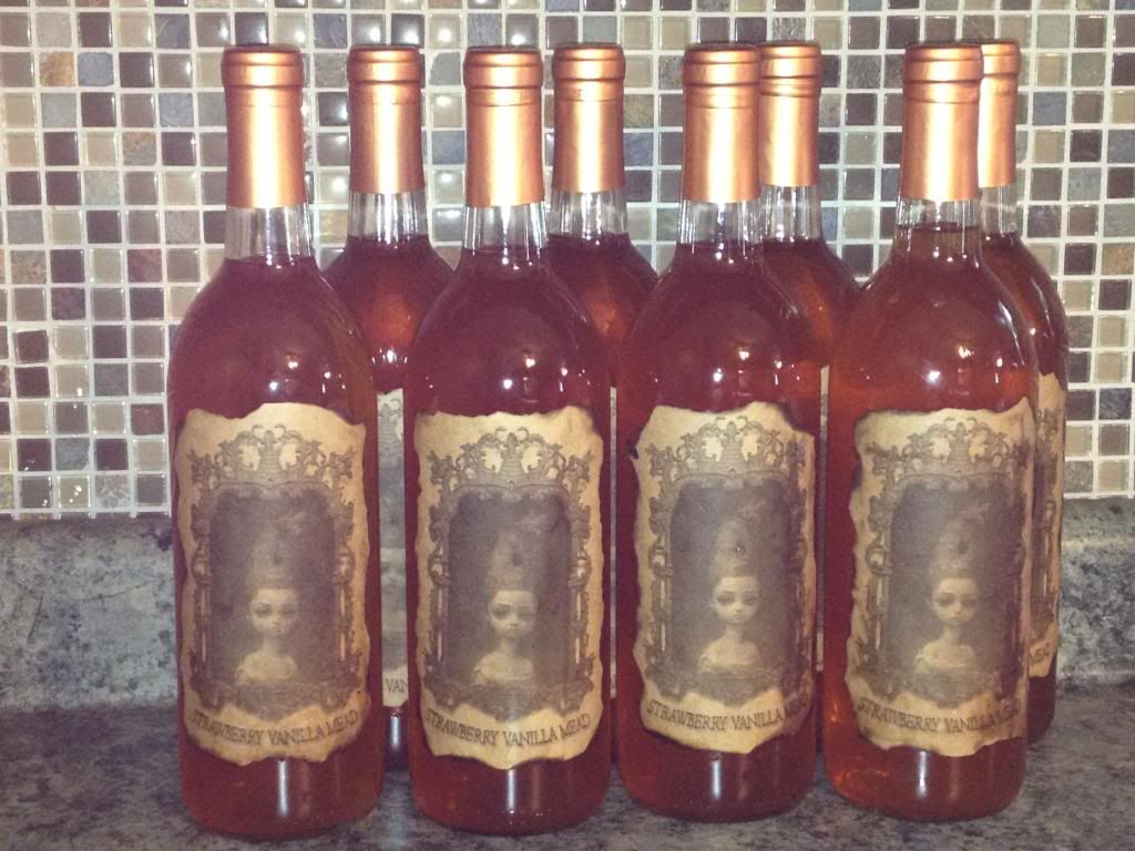


Those are just awesome. I love the look of the paper, the tone of the artwork and text, the burnt edges. Amazing.
reverendj1
Well-Known Member
Good point. The rattletrap printer I'm working with is nothing like top-end either, so the prints come out a lot more pixellated than it looks on the screen.
Ugh, tell me about it. 'S a pain in me arse working on this at home, every time I shift position I have to tilt the screen.
Yeah, I think that's the way to go. I found a how-to on outlining text with the Paths tool, but the only hitch is that it will only outline it in black. Which works fine for this, since I think black outlining red would look better than vice-versa.
Lightened up the red in the name, outlined it in black, kept some drop shadow and brightened up the whole thing. I kinda like it. I have a more current version of GIMP on my laptop at home, when I get back I'll try the 'Oilify' filter on the name text so it looks painted. The version I have on this computer just makes things look blurry and messy.
Still not certain I'm going to use this pic, I have a handful of potential candidates.
I use GIMP a lot. The easy way to do outlining for text is to use the select by color tool. It looks like a finger pointing at a blue, red and green strip. With your text layer selected, use the select by color tool, and select any of the text. Then, create a new layer (full size, transparent), position it underneath the text layer (using the layer dialog), then in the select menu, click grow. Grow it by however many pixels looks good (usually between 1 and 3), then use the paint bucket to fill it in. Make sure to select "Fill whole selection" for the bucket tool options. It may sound hard or like a lot of work, but it only takes a few seconds. Way easier than trying to mess with paths. Afterwards, you can merge the text layer down, and then autocrop layer (both in the layer menu at the top) to move it around if you want. I'm not sure how you got the glowy white stuff behind the font, but you can also use the same method to do that. All you have to do is grow it out more, then use the feather tool under the select menu. Play around with what you feel looks good.
Cool, thanks. I'll give it a try when I get home. Got tomorrow off too, so plenty time to waste mucking about on the laptop with BeerSmith and GIMP.
The glowy stuff underneath is a drop shadow, about 30px wide colored light grey. To my colorblind eyes it's light grey, anyway.
The glowy stuff underneath is a drop shadow, about 30px wide colored light grey. To my colorblind eyes it's light grey, anyway.
RockfordWhite
Well-Known Member
- Joined
- Dec 3, 2007
- Messages
- 473
- Reaction score
- 11
From a graphic design stance, i think you need to give the text alittle texture and drop the outer glow and drop shadow... I think the text needs to fit into the style of the background to really make it look professional


Okay ... so here is a panorama of all the labels I've done so far


ViperMan
Well-Known Member
Good point. The rattletrap printer I'm working with is nothing like top-end either, so the prints come out a lot more pixellated than it looks on the screen.
I've never used GIMP, but also make sure that you have a good resolution to start with - minimum 300 DPI. Otherwise it'll be pixelated on ANYTHING you print.
That last version looks much better - you can still get rid of the white "halo" around the text and replace the black border with a lighter border - that would make it stand out as well.
However, the version you have now works fine as well.
seriousbeef
Well-Known Member
I've never used GIMP, but also make sure that you have a good resolution to start with - minimum 300 DPI. Otherwise it'll be pixelated on ANYTHING you print.
That last version looks much better - you can still get rid of the white "halo" around the text and replace the black border with a lighter border - that would make it stand out as well.
However, the version you have now works fine as well.
GIMP is good, given a bit of time to get antiquated with it.
This was for my latest porter

ViperMan
Well-Known Member
GIMP is good, given a bit of time to get antiquated with it.
Given that I'm relatively handy with Photoshop (though I'm using an older version of it) is there much benefit to going through the learning curve with GIMP?
I think that depends on how many versions back. If your version has adjustment layer capability I think I would stick with Photoshop. Just my opinion, and I have never used Gimp.
ViperMan
Well-Known Member
I think that depends on how many versions back. If your version has adjustment layer capability I think I would stick with Photoshop. Just my opinion, and I have never used Gimp.
I'm using 7.0, which I know is a few versions old. I'm sure with some small effort I can get a newer version, though I heard they're going to an online subscription method to cut down on the pirating (and lol - like, it's about time!) I also really want to get my hands on Illustrator and play with it. But then again, I've literally taught myself to use Photoshop over the past 15 years, and while I'm certainly no whiz, I've had people completely blown away by the things I've done, from "modifying" cars (to simulate chops/channels/custom parts/paint/etc) to removing people/cars/buildings from photos, etc.
Here's one I did just the other day after a car show for my car club.
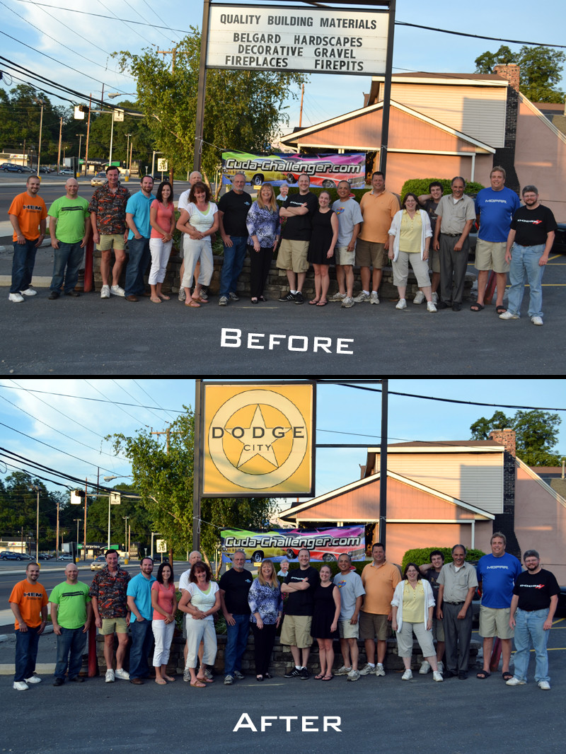
It's not even my best work, but unless I literally pointed out the alteration, I don't think anyone would notice the shadows on the left vertical post not quite matching the shadows on the yellow sign, or the thick wire at the top clipping oddly against the horizontal beam. (By the way that's me in the cargo shorts under the letter 'n'.)
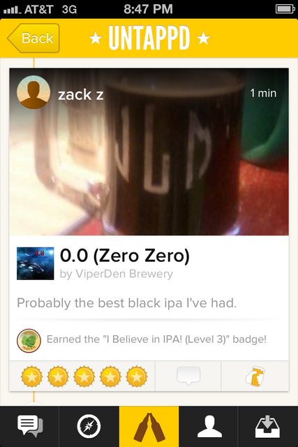
I also just yesterday completed a beer trade with an Untappd user (got me some Terra Incognita!) and he emailed me back that he was blown away by the labels on the two homebrews I sent (The 0.0 Black IPA and the Chocolate Grapevine - both labels I've shared on this thread.)
I did download GIMP and gave it about 5 minutes... I was thoroughly annoyed by then.
It certainly LOOKS robust and powerful, and for free?! Wow! But I think if you're already proficient at one, the other probably won't help you much...Sorry to go off topic.
reverendj1
Well-Known Member
But I think if you're already proficient at one, the other probably won't help you much...
Sorry to go off topic.
This is very true. It is very hard to switch between them. I'm a long time GIMP user, and whenever I've tried using Photoshop (even before I started using GIMP), I thought it was a complete mess. Not because it is, it's just I'm used to things a certain way, same with Photoshop people. If you are proficient with Photoshop and have no problem paying for (or pirating) it, and don't care about open source software or cross-platform compatibility, then there's really no compelling reason to switch.
reverendj1
Well-Known Member
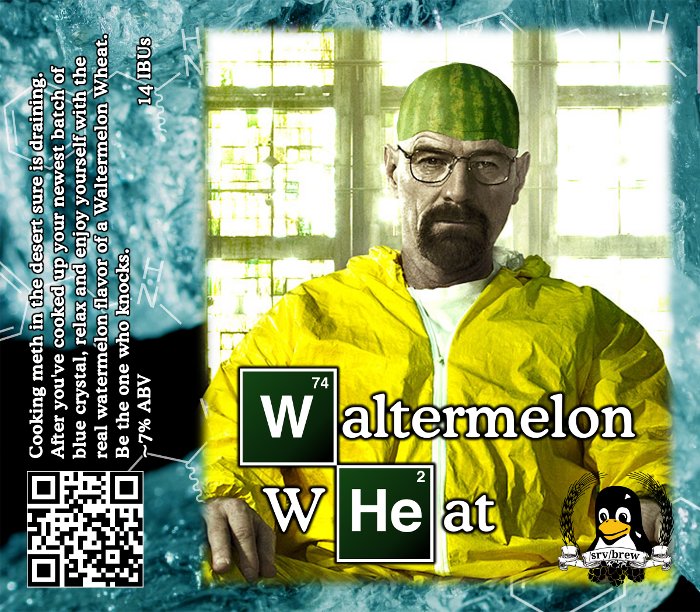
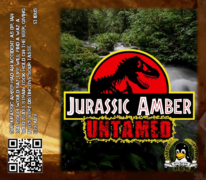
And now, back to our regularly scheduled program, here are a few I just finished.
For National Homebrew Day, our LHBS gave out 48 recipe kits and all got to brew outside in downtown Grand Rapids!
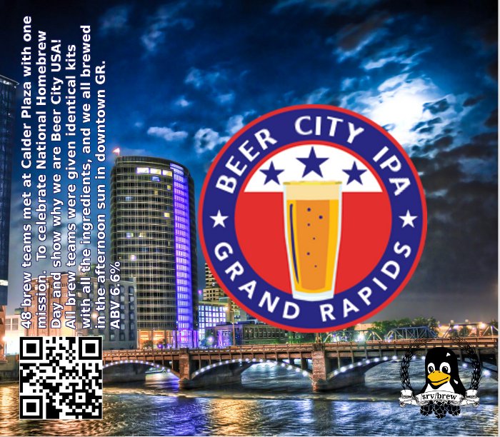
This one was my first try at making a recipe for an amber. It was originally called Jurassic Amber, but it got an infection. I'm assuming it was from pitching yeast the next day. We decided it worked okay as a sour, so we kept it.
For National Homebrew Day, our LHBS gave out 48 recipe kits and all got to brew outside in downtown Grand Rapids!
This one was my first try at making a recipe for an amber. It was originally called Jurassic Amber, but it got an infection. I'm assuming it was from pitching yeast the next day. We decided it worked okay as a sour, so we kept it.
itsme_timd
Well-Known Member
Skeeter Pee!
aiptasia
Well-Known Member
A few of my new ones:


Used Gimp...

dwshotwell
Active Member
My latest labels.

ViperMan
Well-Known Member
A few of my new ones:

Now, just out of curiosity, did you find that image or somehow create it? If you found it, how/where did you find it?
Not that I want to use it, but it's such a specific image, and I don't know where to go to find such specific images...
For example I really wanted a side view of a doghouse with a dog's head poking out of it, overlooking a field, but damn if I could find something so specific without creating it, and I'm just not THAT good...
aiptasia
Well-Known Member
Now, just out of curiosity, did you find that image or somehow create it? If you found it, how/where did you find it?
Not that I want to use it, but it's such a specific image, and I don't know where to go to find such specific images...
For example I really wanted a side view of a doghouse with a dog's head poking out of it, overlooking a field, but damn if I could find something so specific without creating it, and I'm just not THAT good...
Some of it is creation, some of it is borrowing, a little bit of this and that. The top image of the sake label was created by bouncing back and forth between picmonkey and ribbet. The branch on the logo was hand drawn, the background was created from a stock picture of rice paper and the bird was clipart. As to the rice wine label, that background was borrowed from an artists interpretation and I added some quick text additions in Ribbet.
If these were commercial labels, I don't think it'd be cool to borrow other people's source material without permission. But, as these are for my home use and grace only my home brew, I keep my photoshop skills sharp this way.
If it were me, i'd probably have found either a picture of a cool dog in a field and then cropped in a doghouse, or found a cool dog house and cropped in a dog. I have to do that most often with labels like my Scorpion IPA. I took a cool stock photo of a black scorpion and cropped it out of one shot, then pasted it into the label before I airbrushed the tip of the stinger bright red. Different techniques for different labels.

cjalderman
Well-Known Member
Here's what I came up with for a westy 12 clone I'm brewing soon.
ltcolchaz
Member
Here is my latest brew, which is sitting in secondary for clarifying...


ViperMan
Well-Known Member
Some of it is creation, some of it is borrowing, a little bit of this and that. The top image of the sake label was created by bouncing back and forth between picmonkey and ribbet. The branch on the logo was hand drawn, the background was created from a stock picture of rice paper and the bird was clipart. As to the rice wine label, that background was borrowed from an artists interpretation and I added some quick text additions in Ribbet.
If these were commercial labels, I don't think it'd be cool to borrow other people's source material without permission. But, as these are for my home use and grace only my home brew, I keep my photoshop skills sharp this way.
If it were me, i'd probably have found either a picture of a cool dog in a field and then cropped in a doghouse, or found a cool dog house and cropped in a dog. I have to do that most often with labels like my Scorpion IPA. I took a cool stock photo of a black scorpion and cropped it out of one shot, then pasted it into the label before I airbrushed the tip of the stinger bright red. Different techniques for different labels.
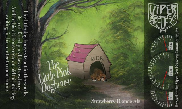
Oh I agree - as I'm just making homebrews, I have no qualms "borrowing" images. This is just for fun. The challenge I have is finding "just the right image" for what I'm thinking. I can "mix" images, but then it's a real challenge to get the same look, the same lighting, and making it look like it all "belongs."
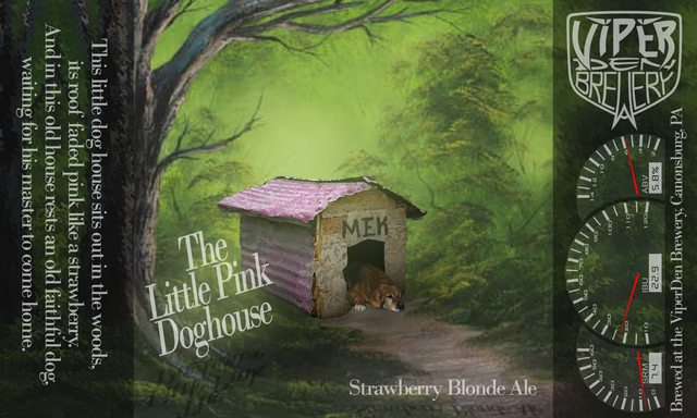
This is what I came up with - I couldn't find a dog house image at the angle I wanted, so I mixed a painted "forest", a cartoon dog house, and a handdrawn dog, used artistic effects in Photoshop to create some similar effects in each image, and then spent hours messing with shading, shadows, and layer effects (overlays and such) to try to make it all look like an original image. I'm actually pretty pleased with it, even if it wasn't what I originally had in mind.
ViperMan
Well-Known Member
Here is my latest brew, which is sitting in secondary for clarifying...
There's another - where the heck did you find that image?!?! That looks awesome!
**EDIT** Aah never mind I found it...
Still - that's a perfect find for your beer/title.

ViperMan
Well-Known Member
These images inspired me a bit though, and I messed with my label a bit more and used a different doghouse photograph. It was actually much easier than the cartoon version to blend in, and I like it much better.
Old:
New:
Old:
New:
ltcolchaz
Member
There's another - where the heck did you find that image?!?! That looks awesome!
**EDIT** Aah never mind I found it...
Still - that's a perfect find for your beer/title.
Yeah, I usually troll the interwebs to find a perfect pic for my label concept. Since I am not selling it, and usually only label those bottles I give away to friends, I don't fear copyright issues (maybe I should?).
As for process, I simply use Powerpoint, and hand jam everything else to fit the concept in my head. Again, these are not mass produced, so I am mainly just having fun, for the entertainment of my beer recipients...
CHUCK

Similar threads
- Replies
- 4
- Views
- 601
- Replies
- 7
- Views
- 987
- Replies
- 89
- Views
- 4K
