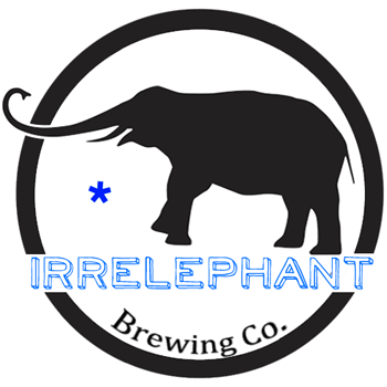
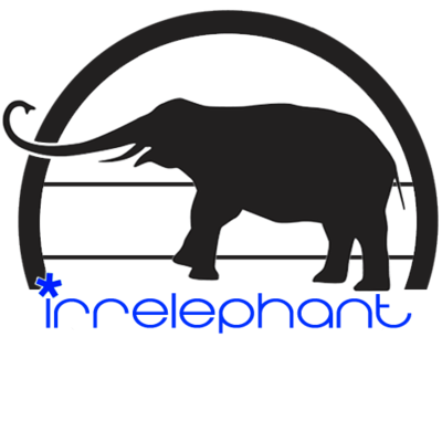
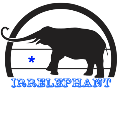
First draft of the logo. Critiques please?

Homebrew Talk - Beer, Wine, Mead, & Cider Brewing Discussion Forum

Help Support Homebrew Talk - Beer, Wine, Mead, & Cider Brewing Discussion Forum:

This site may earn a commission from merchant affiliate links, including eBay, Amazon, and others.

Irrelephant

Active Member
Joined
Apr 10, 2013
Messages
29
Reaction score
6
Location
TR - NJ
Was just messing around on Photoshop tonight during a thunderstorm. What'ya guys think?

I know it needs some work, so critiques would be greatly appreciated. I'm not thrilled with the text but I'm off to bed for the night, I'll worry about it in the A.M.


EDIT:
Consolidated some of the popular ones here.

1.
TxEjHm4.png

2.
eZ1tPnR.png

3.(Courtesy of Machinelf)
irrelephant.png

4.
6uvI7AE.png

5.
cu8ge8b.png

6.
oPvCu7t.png
 
Great concept! Here are my initial thoughts. (Take this all with a grain of salt, its YOUR logo!)

I think the round border is way too heavy, the elephant part of the graphic should be the dominant visual element. Might even look cool if the elephant were to cross over the border slightly, like it was too big for it (a common design trick).

I like the main font ok, but the font beneath it seems completely unrelated. If you want to use two different fonts in a single logo, I'd have the main one be the one with character, and have the second be a more clean, neutral choice, like a Helvetica or Futura. I'd probably have the secondary line be all caps too, since the main name is that way, and the secondary text will be smaller. Sometimes it helps to try and picture a logo as it is often used--small as hell and only in black--will the text hold up or be too thin?

Hope that helps. :mug:
 
irrelephant???

isn't that kind of like naming a new model of car the 'flaming ball of twisted metal'?

Not sure, but I don't think so.


Great concept! Here are my initial thoughts. (Take this all with a grain of salt, its YOUR logo!)

I think the round border is way too heavy, the elephant part of the graphic should be the dominant visual element. Might even look cool if the elephant were to cross over the border slightly, like it was too big for it (a common design trick).

I like the main font ok, but the font beneath it seems completely unrelated. If you want to use two different fonts in a single logo, I'd have the main one be the one with character, and have the second be a more clean, neutral choice, like a Helvetica or Futura. I'd probably have the secondary line be all caps too, since the main name is that way, and the secondary text will be smaller. Sometimes it helps to try and picture a logo as it is often used--small as hell and only in black--will the text hold up or be too thin?

Hope that helps. :mug:

Actually all very good advice. I was never really happy with the lower font but the stuff about the elephant and the boarder make perfect sense. Revisions will start shortly. Thanks for the input.
 
Round 2.

eZ1tPnR.png


Still not please with the bottom text but just got it together for the concept of it. Thoughts?

EDIT: Should I give the elephant an eye? I was thinking either white or blue.
 
I like it.

Personally I would have it ALL in black except for that blue asterick. It would really pop.

No eye, no, I dont think.
 
I hope you don't mind, but I was working in Illustrator a few minutes ago and got to thinking about your logo and so I did a version really quick. It's rough, but I figured I'd share it with you. (Don't know why it's posting so big, sorry.)

irrelephant.png
 
I hope you don't mind, but I was working in Illustrator a few minutes ago and got to thinking about your logo and so I did a version really quick. It's rough, but I figured I'd share it with you. (Don't know why it's posting so big, sorry.)

irrelephant.png

Wow that looks phenomenal. Gives me a ton more ideas and inspiration. Thanks for all the advice and help brotha, I really appreciate it.

In the mean time, the newest batch.
1.
jgxfcaa.png


2.
hNhWeox.png


3.
gjRXYMd.png


4. http://imgur.com/TgWVLxj (link b/c the negative space doesn't show on the white forum BG)


P.S If anyone wants anything simple (read: not time consuming) feel free to ask!

Back to Photoshop! The circle could use some more slimming down, I must admit.
 
I personally liked it when the astrix was either above the I or at the nose of the elephant. Otherwise looks good.
 
I personally liked it when the astrix was either above the I or at the nose of the elephant. Otherwise looks good.

You read my mind! I really like the first one w/ the asterix above the I. We shall see. I am going to whip up another design and see what comes out of it.

1.
X7wxNjX.png


2.
JcfZAyh.png


3.
NCEie5j.png
 
I like the font in #2 of the last batch. But something about the line the elephant is on bugs me. I think it would look a little better if the elephant was rotated counter-clockwise just a bit.

Love the name by the way. Reminds me of Clutch - Elephant Riders.
 
I like it too. perhaps this is cliche: but if rather than the whole elephant, you had a front on view of the elephants face, you might be able to have some fun with the facial expression......playing off the word irrelephant?

there is nothing irrelephant about beer.
 
I like the font in #2 of the last batch. But something about the line the elephant is on bugs me. I think it would look a little better if the elephant was rotated counter-clockwise just a bit.

Love the name by the way. Reminds me of Clutch - Elephant Riders.

After looking closer the elephant's rear leg is lower than the cut of the circle. As a wanna-be designer I should have known better. I'm fixing it now. And thanks for the recommendation on text. I have the hardest time picking fonts, it's ridiculous.


I like it too. perhaps this is cliche: but if rather than the whole elephant, you had a front on view of the elephants face, you might be able to have some fun with the facial expression......playing off the word irrelephant?

there is nothing irrelephant about beer.

I will be working on an alternate design tonight. I think you picked a winner for what it's going to be!

EDIT:
Newest take:
oPvCu7t.png
 
Told you Neighbors does nice work. I like that last one the best out of all them!

Refering to the one with the balancing elephant? Yeah that's my favorite too and it was the quickest to make!

Also nice to see another New Jersian on here! :mug:
 
That one was cool too...actually referring to last one Neighbors made...the blue one with the star in the eye
 
Back
Top